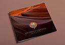
ARIZONA COPPER
logo design & branding blends cactus With paintbrush

The Challenge
Client: Arizona Copper
Industry: Residential & Commercial Painting Services
Services: Brand Strategy, Logo Design, Graphic Design
Arizona Copper, a professional house painting company in Phoenix, required a distinctive brand identity that would elevate them above the crowded residential trade market. In an industry dominated by generic paint rollers, dripping cans, and house silhouettes, the goal was to create a memorable mark that communicates regional roots, professional craftsmanship, and creative attention to detail.
The Visual Concept & Design Strategy
The core identity centers around a clever visual pun: a seamless fusion of an iconic Southwestern saguaro cactus and a classic house-painter’s paintbrush.
The Symbol
The ferrule and bristles of the paintbrush form the central body of the cactus, while the sweeping arms mirror the saguaro silhouette. A subtle drip detail at the base ties the mark directly to the fluidity of wet paint and hands-on skill.
Typography & Structure
Paired with strong, clean, modern typography that ensures instant legibility on contractor vehicles, yard signs, and digital platforms.
Color Palette
Built around rich, metallic copper and warm desert earth tones—honoring the brand name while establishing a refined, premium aesthetic that inspires trust with homeowners and commercial clients alike.
Deliverables & Brand Assets
Primary Logomark & Wordmark: Vector-optimized mark engineered for high visibility on apparel, lawn signage, and vehicle wraps.
Brand Style Standards: Color specs, typographic hierarchy, and application rules for physical collateral and web media.
Local Brand Assets: Scalable graphics designed for business cards, vehicle graphics, signs, and customer quotes.